Neo-Brutalist Brand & Design System: Dashboard Visual Identity
Neo-Brutalist Brand & Design System
The Design Direction
Financial dashboards have an aesthetic problem. They almost universally default to one of two looks: corporate blue (trustworthy but cold and generic) or dark-mode fintech (sleek but soulless). For a personal tool, neither felt right. The dashboard needed a visual identity that felt human, approachable, and a little irreverent, something that makes checking your finances feel less like opening a bank statement and more like flipping through a well-designed zine.
Neo-brutalism provided the answer. Thick borders, bold typography, generous white (cream) space, and a limited color palette that lets the data be the visual focus without the interface disappearing into corporate blandness.
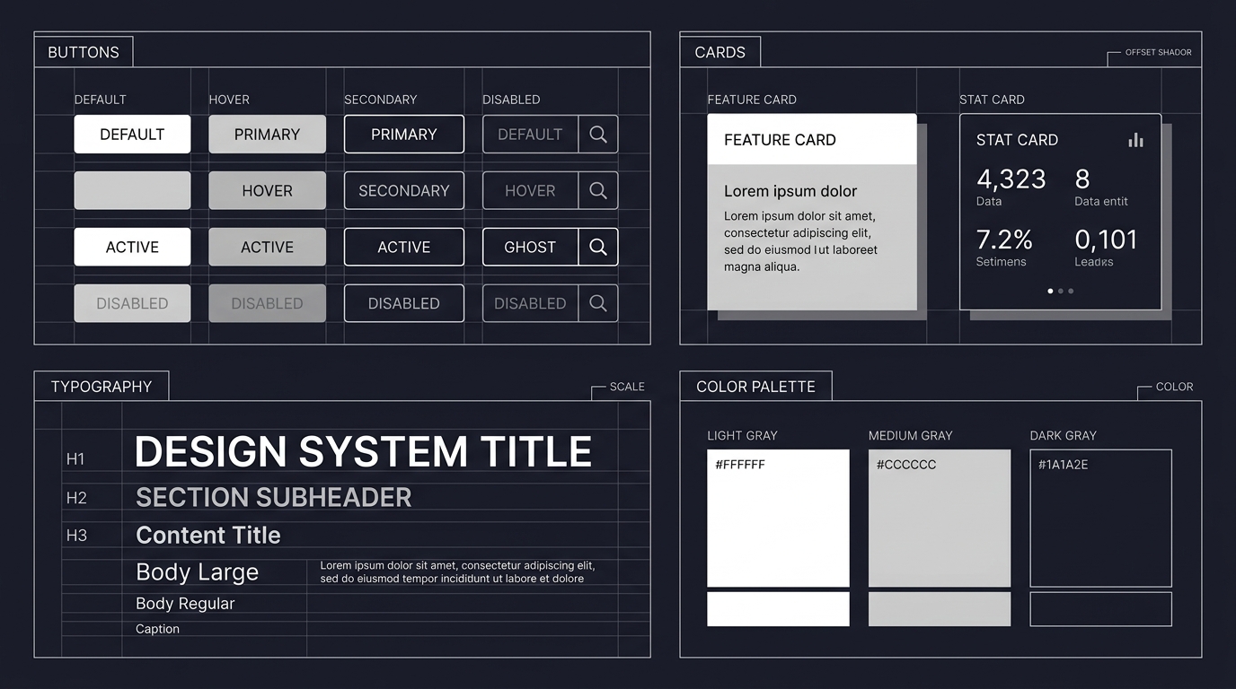
Design System Components

Palette. Cream (#FFF8E7) as the primary background. Orange (#FF6B35) for primary actions, highlights, and data emphasis. Black for borders, text, and structural elements. The palette is deliberately constrained: three colors plus their tints handle every use case, and the warm cream-orange combination prevents the "spreadsheet anxiety" that cool-toned financial interfaces often trigger.
Typography. A sans-serif primary face at generous sizes. Numbers use a monospace variant for column alignment in transaction lists. Headers are bold and oversized in the neo-brutalist tradition, making section transitions unmistakable.
Borders and Shadows. Thick (2-4px) black borders on all interactive elements. Drop shadows are offset (no blur) in the brutalist style, creating a stacked-paper effect that gives depth without the uncanny-valley smoothness of material design shadows.
Data Visualization. Charts use the orange-cream-black palette exclusively. No rainbow color scales. Category differentiation uses pattern fills (hatching, dots, dashes) alongside color, maintaining readability for colorblind users. The traffic-light system at Level 1 uses green/amber/red with icon reinforcement.
What This Demonstrates
Design thinking applied to a domain (personal finance) where defaults are rarely questioned. A complete design system, not just a color scheme but typography, components, data visualization rules, and accessibility considerations. The ability to make deliberate, defensible aesthetic choices and articulate why they serve the user. And proof that "doctor who builds things" extends to visual design, not just backend engineering.
Part of a dashboard project. See also: Full-Stack Engineering, Government Open Data Pipeline, Product Design, and Infrastructure.
* Images are conceptualized, not the real implementation to protect client's intellectual right